
E Learning App Case Study
Batool Ronaghy LMS App
Batool Ronaghy Learning Management System (LMS) app is a revolutionary mobile application. It furnishes an engaging, user-friendly platform for online learning; it was designed with versatility in mind – offering a diverse range of courses and quizzes. Users thus gain empowerment–they can augment their skill sets and broaden their knowledge across various fields. This case study probes into the development process: it illuminates key steps taken and tools employed–with particular emphasis on the design phase executed via Figma.
Supported Platforms

Tools Used


Objective
Develop a mobile application that provides online learning, offering an array of courses and quizzes on diverse topics; this app must boast a user-friendly interface.

Design Phase
1. Understanding User Needs
- The project started with a thorough analysis of the target audience and their learning requirements.
- In close collaboration with the Batool Ronaghy Foundation, key features and functionalities were identified: a strategic approach aimed at meeting users’ needs.
2. Wireframing
- To establish the app’s basic structure wireframes were created; these defined key element placements–navigation menus, course listings and quiz interfaces.
- The initial wireframes were shared with the client, seeking their feedback and approval as a prerequisite to progressing towards the subsequent stage.
3. Prototyping
- Figma was utilized to develop interactive prototypes: this approach offered a more tangible experience of the app’s navigation and user flow.
- User feedback and client input refined the prototypes, ensuring a seamless–and intuitive: user experience.
4. Visual Design
- Once a solid structure and seamless flow was established, attention was shifted towards integrating Batool Ronaghy Foundation’s branding elements and crafting an aesthetically appealing interface.
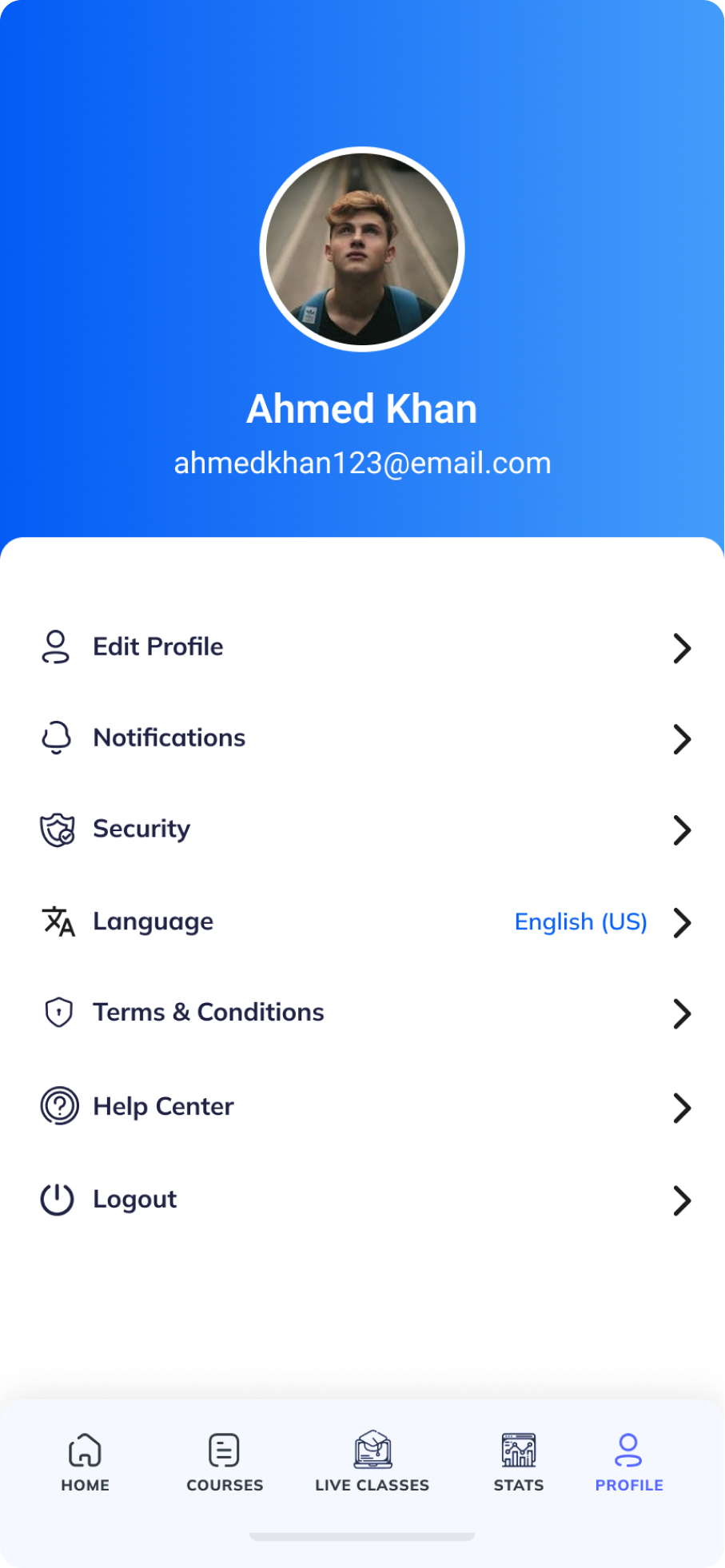
- High-fidelity mockups were developed to exhibit the app’s final look: these encompassed color schemes, typography, and iconography.
5. Iteration
- Through iterative design cycles, the final product’s alignment with our vision and accomplishment of our foundation’s goals was guaranteed.
Style Guide
A cohesive style guide ensures the website’s visual identity remains consistent, offering a polished and immersive experience for visitors, reinforcing the website’s brand presence.
Logo
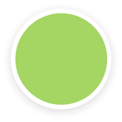
Color Palette
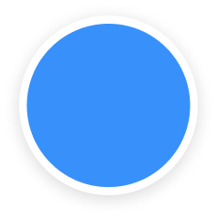
3891FA
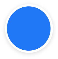
2078F8

F78772

F9C42D
393939

000000
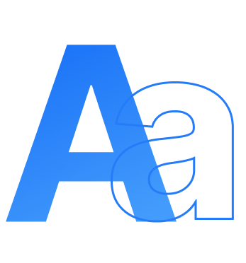
Typography
- Fonts
- Roboto
- Heading
- Roboto - 24 px
- Roboto -18 px
- Body Text
- Roboto -16px
- Roboto -14px
Development Phase
1. Technology Stack
- Flutter was chosen for app development, providing a cross-platform framework for building iOS and Android applications.
2. Agile Development
- The development process followed agile methodologies, allowing for incremental updates and continuous testing.
- Regular sprints and feedback loops ensured that the issues were promptly addressed, and changes were incorporated as needed.
3. Testing and Quality Assurance
- Throughout the development process, testing was rigorously conducted –unit testing; integration testing; and user acceptance testing.
- The feedback garnered from the beta testing phase proved instrumental in identifying and subsequently resolving all remaining issues prior to the official release.
UI Screens
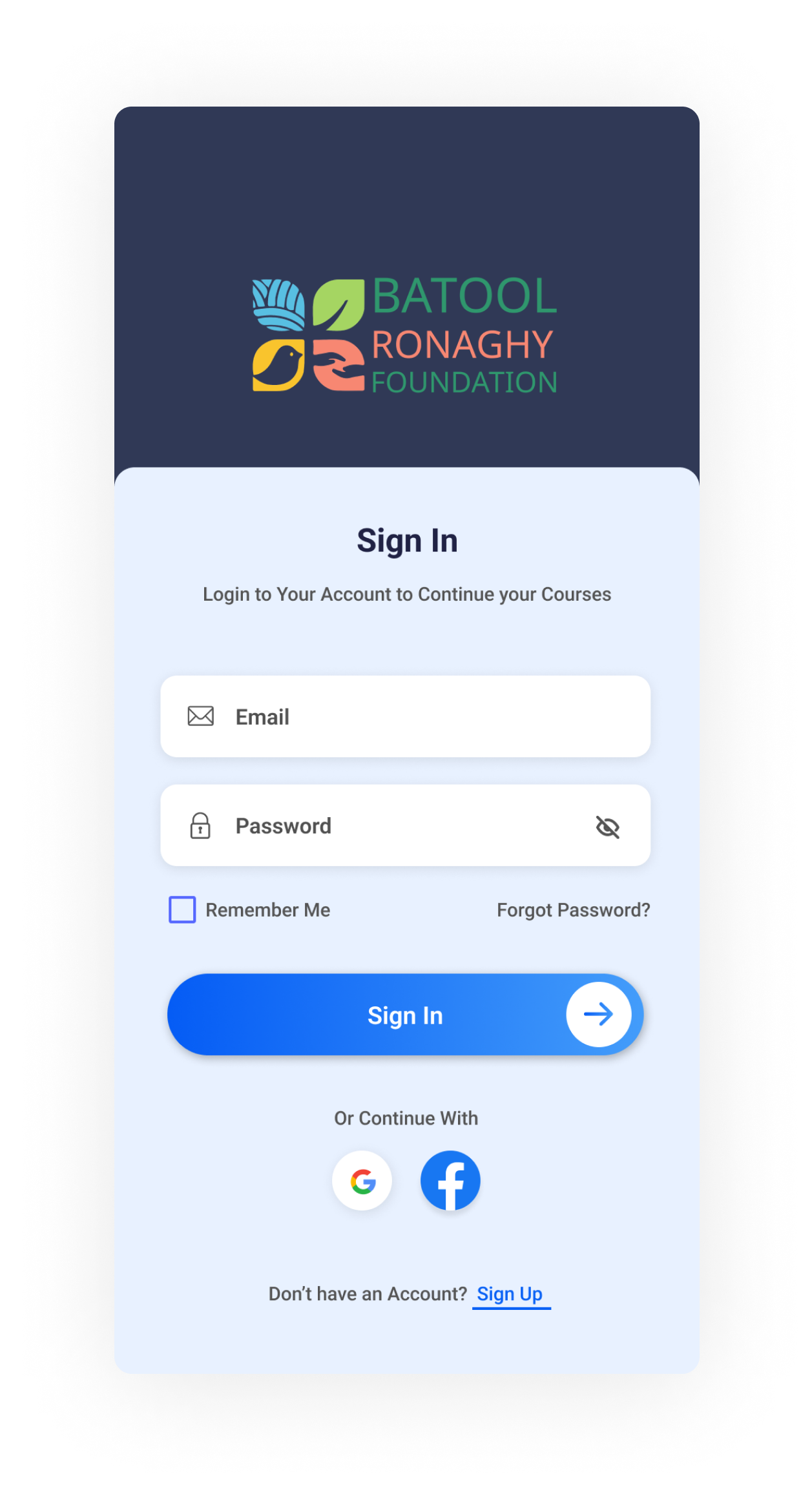


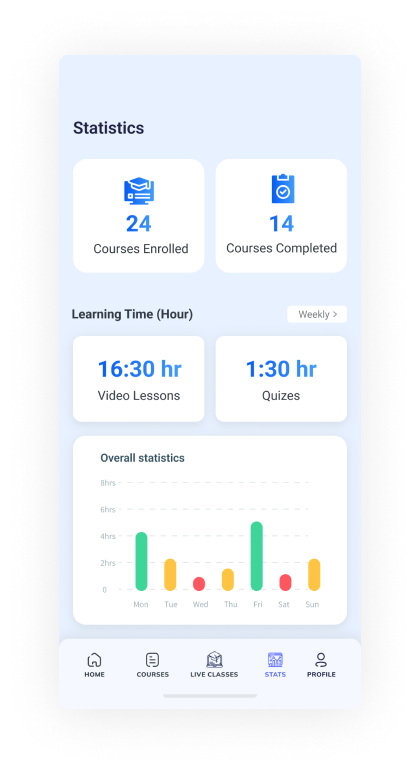

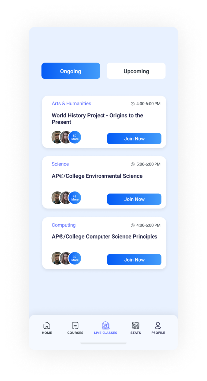
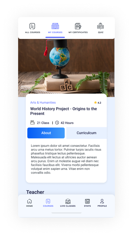

Client’s Testimonial


Presentation
